THE SATURN COPLANNER APP
Role
Product Designer
Deliverables
Mobile App Design
Company
Saturn
Year
2024
About this project
Designed a revamp of our app after a brand and product overhaul. I worked closely with my mentors Aniket Yadav and Ranjith Nair on this. Huge shoutout to them for the learnings I got the opportunity to explore. Here I share the learnings, but first I'd like to show you a bit of the images we got along the way.
About the CoPlanner App
The product got generated due to the core market being financial advisers needing to keep a source of truth for compliance reasons. We got to this conclusion by surveying the market and looking at the governing body; the Financial Conduct Authority(FCA).
Used to record client meetings
Focus on clients feeling safe while recording
Allow playback and secure share

The brief
The product got generated due to the core market being financial advisers needing to keep a source of truth for compliance reasons. We got to this conclusion by surveying the market and looking at the governing body; the Financial Conduct Authority(FCA).
A look at my process
Understand the industry
1
Questions how it is the way it is being done and why.
Here’s where I’ve done research on competition as well.
Understand the users
2
Know EVERYTHING about my users. EVERYTHING!
Here’s where I can go crazy with 💡ideas and 📱prototypes and diverge
Solutionising
3
Figuring out different approaches and solutions.
Here’s where I cut down wacky and crazy ideas and pick out the best.
Testing and UAT
4
Both internal and external feedback is taken and iterated apon


Discussed business and design goals
We wanted to only focus on the most important needs to make the Saturn CoPlanner app a viable product.
Tech Needs
Adviser Needs
Business Needs
Design Goal
Provide an intuitive, unobtrusive experience for capturing meeting data—where advisers can seamlessly record and retrieve key information without undermining client rapport or sacrificing compliance needs while keeping in mind adviser familiarity and keeping room for future feature enhancement.
Business Goal
Deliver a unified, compliant documentation platform that reduces operational costs (less manual effort, fewer errors), mitigates compliance risk (FCA regulations), and improves adviser efficiency—ultimately enhancing ROI while maintaining data security and client trust while driving similar user behaviours
I mapped out the current flow and features


Solutionising
Now that we know what we want from the solution, let’s start diverging on how we can solve this! I first made flowcharts of main flows There were initially 10 flows that have been extracted and can be possible, however we only went with the 4 due to resource constraints:
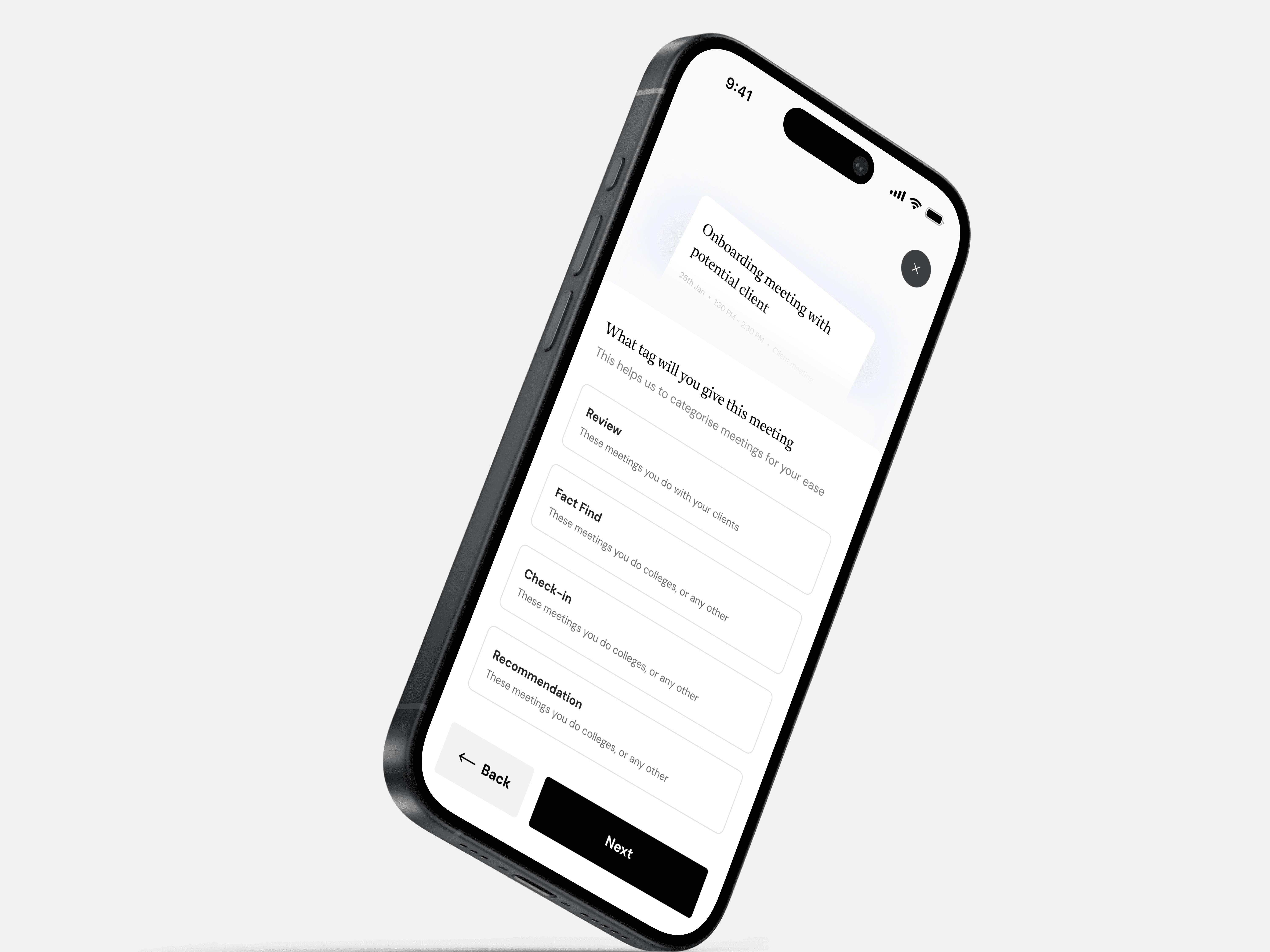
Meeting Recording Flow
Process for recording meetings, addressing compliance, sensitive segment handling, consent, and UI warnings. Ensures proper documentation, auto-tagging, and client profile links.
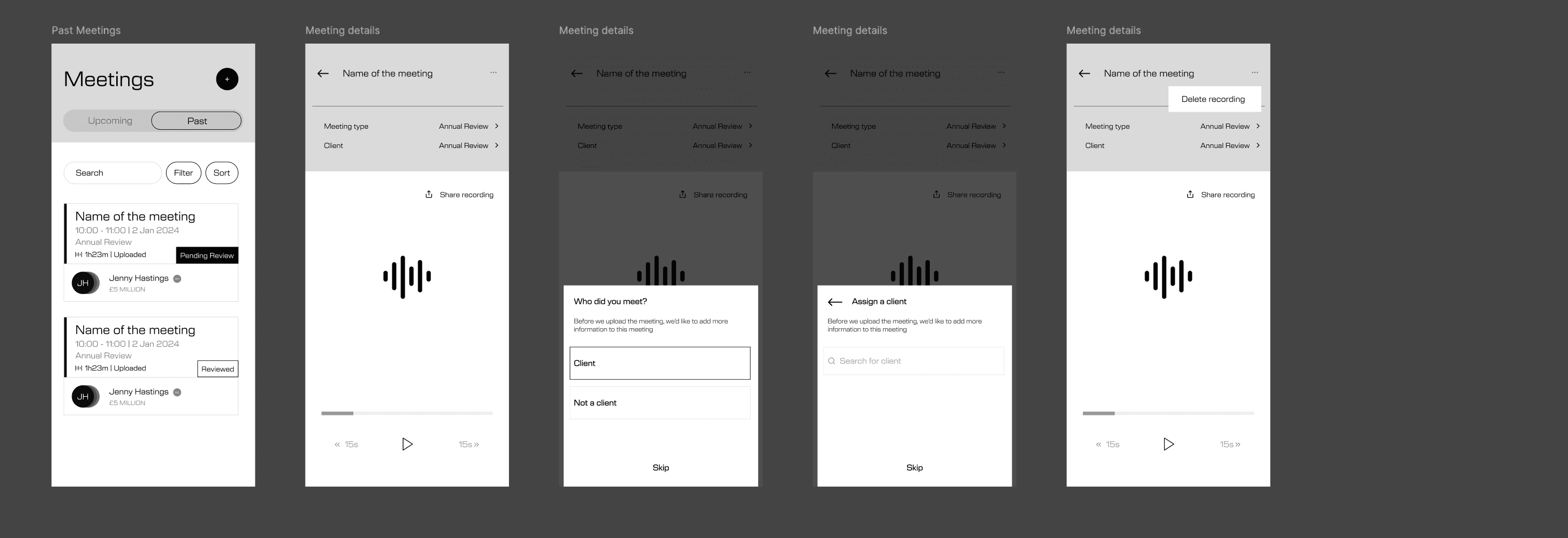
Past Meetings Flow (Status)
Shows how users interact with meeting records, featuring status indicators, role-based views, filtering, search, annotations, task links, and confidentiality.
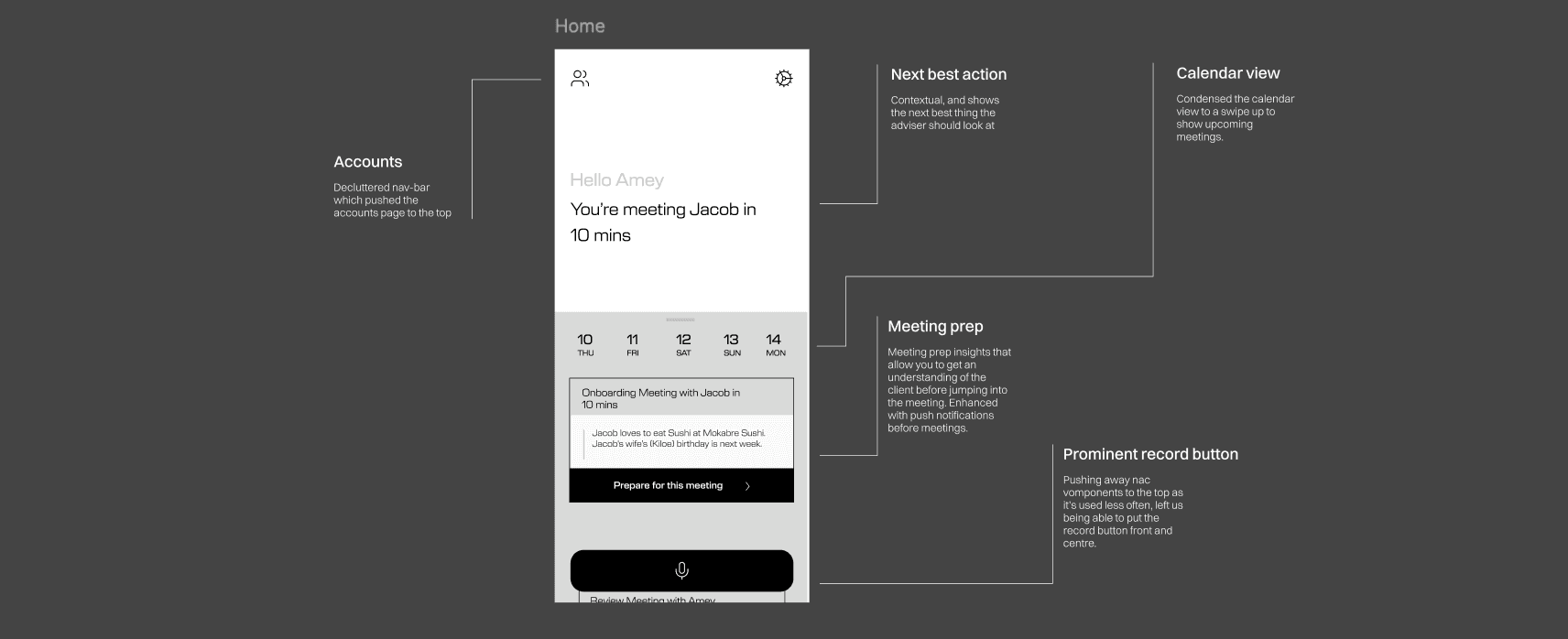
How My Day Looks (Home)
Daily scheduling with calendar integration, focusing on sync, scheduling, conflict resolution, and meeting labeling. Features include notifications, alerts, and actions.
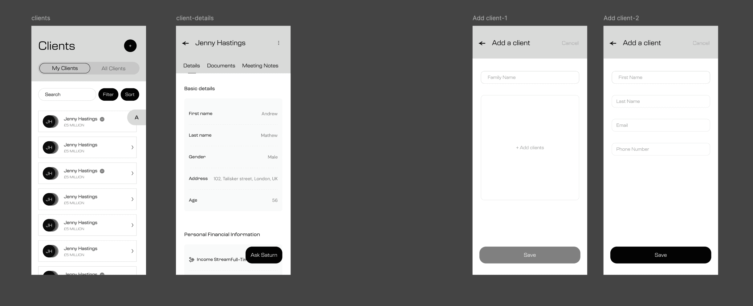
Adding a client
Shows the flow to add clients and meeting types to a recorded meeting, including adding new clients from the phone and assigning them to an adviser.
Meeting Recording Flow
Here are the Lofi wireframes and flowcharts I have created according to what we need. On the left would be the home screen, where the adviser would be able to see all their meetings for that day and in the future. They can prepare for the meeting with a feature we can call meeting prep.

Past Meetings Flow (Status)
Here are the wireframes and low-fi screens for meeting details after recording. A new feature allows listening to, deleting, and sharing the recording. It’s stored in the Saturn cloud, but feedback suggests advisers should access it, send it via Teams to paraplanners, and add context to the recording.
How My Day Looks (Home)
Here are the wireframes for the home screen of "CoPlanner." It’s designed to be simple and contextual, giving advisers easy access to essential features.
Next Best Action: Suggests the most important task based on client data, meetings, and actions.
Calendar View: Compact calendar with detailed scheduling on swipe-up.
Prominent Record Button: Centrally located for easy meeting documentation access.
Adding a client
When a meeting concludes or there are incomplete details (e.g., client name and meeting type), this low-fi and flowchart illustrate the process for updating the meeting with the missing information. The flow guides users through the steps to add client details and meeting type, ensuring complete and accurate meeting records.
Crafting the UI
I took this time to diverge on the different styles that could be made. Even though Saturn does have a visual language, Saturn CoPlanner needed a new identity that was also familiar. I wanted CoPlanner to be more physical. Layers that show that it's a mix between physical and digital. Here are a few design languages I explored after scouring Pinterest for ideas.

Top: Lots of meetings with the developers to know what’s feasible and what isn’t. Some very fuzzy pictures cz I was focusing on the process. Some features that I would have loved our users to have got pushback due to a lack of time.


Right: Explored different UIs. Needed this exploration to diverge.
Bottom: A feature that we couldn't incorporate was adding the functionality of tasks into the meeting to note down important parts.

Documentation and handover
To give a good developer hand-off, I made documentation for each state and what should happen and also when into detail why it has to occur like that.